Throughout my graduate career, I've realized that I quite enjoy the process of creating data visuals and using them as another tool to tell stories about complex scientific concepts in a more approachable way. I've honed my skills by creating figures for my research papers and posters, coursework, and working on personal projects. Take a look at some of my work below!
AREPAS🫓: A Resource for Exploring Protostellar Accretion Systems
Leveraging my experience from making the Interactive Local Volume Database (detailed below), I went on a side quest from my usual galaxies-related research to work with fellow grad student Marbely Micolta on an interactive app for
protoplanetary disk researchers. Stars are born from the collapse of a molecular cloud, which flattens out to form a disk around the protostar to conserve angular momentum.
In many T Tauri stars -- young (1-10 Myr), low-mass (<1M☉) pre-main sequence stars -- the inner part of the disk is truncated by magnetic field lines, which also act as "highways" that guide rocky material
that has reached the inner disk onto the star, impacting the star at free-fall velocity in magnetospheric accretion flows.
Not only is this one of the primary mechanisms by which these prostars grow in mass, but they are also important tracers of the presence (or absence) of rocky material that can build planets!
Marbely and her collaborators study what processes govern the composition of this rocky material in the inner 10 AU of protoplanetary disks. Specifically, they look at the presence of different optical and UV emission lines that can trace the composition of material in these flows and the mass accretion rate of the protostar. As part of this work, they ran a large grid of models of strong T Tauri emission line profiles, which can be compared to line profiles from observed protoplanetary disks to constrain their mass accretion rates and disk parameters.
To make it easier to explore this model grid, Marbely and I collaborated to create the AREPAS🫓*app. This open-source app lets users plot and compare model profiles for sets of different spectral lines, mass accretion rates, temperatures, disk geometries, inclinations, and abundances, and also allows users to upload their own observed profiles to compare to the models and estimate a coarse grid of parameters that may be used as a starting point for fitting their data. Users can plot the raw line model fluxes, fluxes normalized to the continuum, or line luminosities, and the app also calculates the integrated flux of each model profile. The plot has hover/zoom/panning capabilities, and users can also download a csv file of specific models of interest without having to download the full dataset.
This work has been written up in a Research Note of the AAS! Any comments/suggestions/bug finds are much appreciated and can be reported on the project's Github repository!
*AREPAS🫓 is named after the arepa, a delicious South American stuffed corn flour flatbread commonly eaten in Venezuela and Colombia. They can stuffed with a variety of fillings, including meat, cheese, avocado, beans, fried plantains (my favorite), and other ingredients that vary from place to place.
Interactive Local Volume Database
While working on a research project on ultra-faint dwarf galaxies, I found myself frequently using Andrew Pace's Local Volume Database (LVD)
on Github to look at properties of nearby dwarf galaxies and star clusters. Users can access the raw data through a spreadsheet program or read it into a programming language like Python,
which was wonderful for making publication-quality figures, but it was hard to just explore the data -- answering questions such as "how does the metallicity of a certain galaxy compare with other dwarfs in a specific luminosity range?"
or "how do Milky Way dwarfs compare to Andromeda dwarfs in terms of size?" requires data wrangling and coding.
As a side project, I created an interactive web app that allows users to explore trends and build intuition about local dwarf and globular cluster properties, as collated in the LVD. I wanted to have an easier way to just explore the data, look at relationships between different properties, and look at individual objects in more detail. Users can quickly make scatter plots of all the different system properties (mass, metallicity, half-light radius, etc.) and filter by the host galaxy and other system properties. You can pan and zoom around the plot, hover over data points to see the selected properties of the system, change the colors of the points, and show the properties and raw data for specific systems.
The interactive LVD is still actively in development, and I plan to add more features such as the ability to make histograms of a specific system property and adding links to the relevant literature for each property and object. Any comments/suggestions/bug finds are much appreciated and can be reported on the project's Github repository!
SI 649: Information Visualization
In the Winter 2024 semester, I took my first formal foray into learning about data visualization by taking a course on Information Visualization from the University of Michigan's School of Information. We completed three mini-projects for the class, focusing on different types of data visualizations.
Static Visualization
Our first project required us to create three static visualizations to accompany a NYT news article about the migrant crisis in the US.
The purpose of these visuals was to enhance and add context and detail about the article, which cites a lot of statistics but does not include any original visuals to go with them.
I chose to focus on making visuals (pictured right) showcasing the story of why asylum seekers are leaving,
how the countries they come from and what US states they've been going to have changed over time, and how overwhelmed the US immigration system is.
Click below to see the full-sized visuals, the original article and my annotations, and the write-up of my thought-process in making these visuals.
Scientific Visualization
Our second project challenged us to take an existing static visualization from a scientific paper and recreate it as an interactive version that can be used to support the reader in their understanding of the data.
Though we were given several papers to choose from, I chose find my own paper and dataset and recreated a figure from a well-cited review paper we had discussed at length in my graduate galaxies class:
“Physical Properties and Environments of Nearby Galaxies” by Michael Blanton and John Moustakas.
I combined Figures 8 and 12 from the paper into an interactive visualization that allows users to explore the relationships between galaxy properties such as stellar mass, color, Sérsic index, and size in the context of different galaxy morphologies (pictured right). Hovering over a point in one of the scatter plots highlights that galaxy in the other plots and displays the relevant characteristics in a tooltip, while clicking on the point brings up an image of that galaxy. The colors of each morphological type (i.e. E, S0, Irr) are also customizable, and one can select individual types to focus on.
This was my first time working making an interactive visualization, and this project inspired and gave me some of the tools and skills I needed to create the interactive Local Volume Database web app later on. In the future I hope to go back and revamp this project to make it look nicer, add more features, and make it more user-friendly.
Narrative Visualization
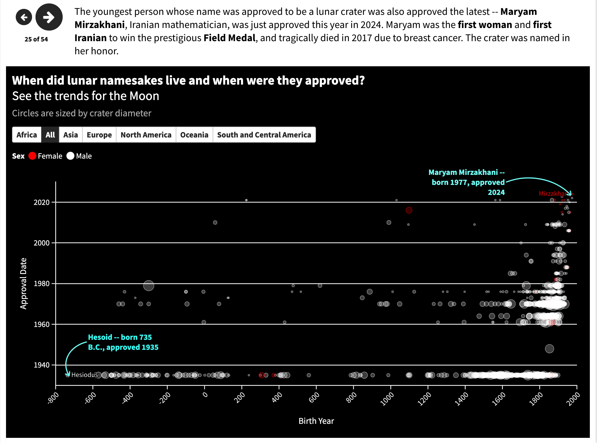
Our last project combined the skills we learned in the previous two projects and required us to create a narrative visualization that tells a data-driven story,
combining text with integrated interactive visuals. We had the freedom to choose any topic we wanted, so I wanted to create a narrative about space that was more human-centric.
I decided to investigate the namesakes of planetary and lunar features in our Solar System, and how they reflect some of the values and biases of the people who named them.
I compiled and hand-cleaned data from the United States Geological Survey's (USGS) Gazeteer of Planetary Nomenclature, which contains the names and descriptions of all named features on planets and moons in our Solar System. This narrative explores the genders, professions, and nationalities of the individuals who have been honored with namesakes in our Solar System, as well as general naming conventions as set by the International Astronomical Union (IAU).
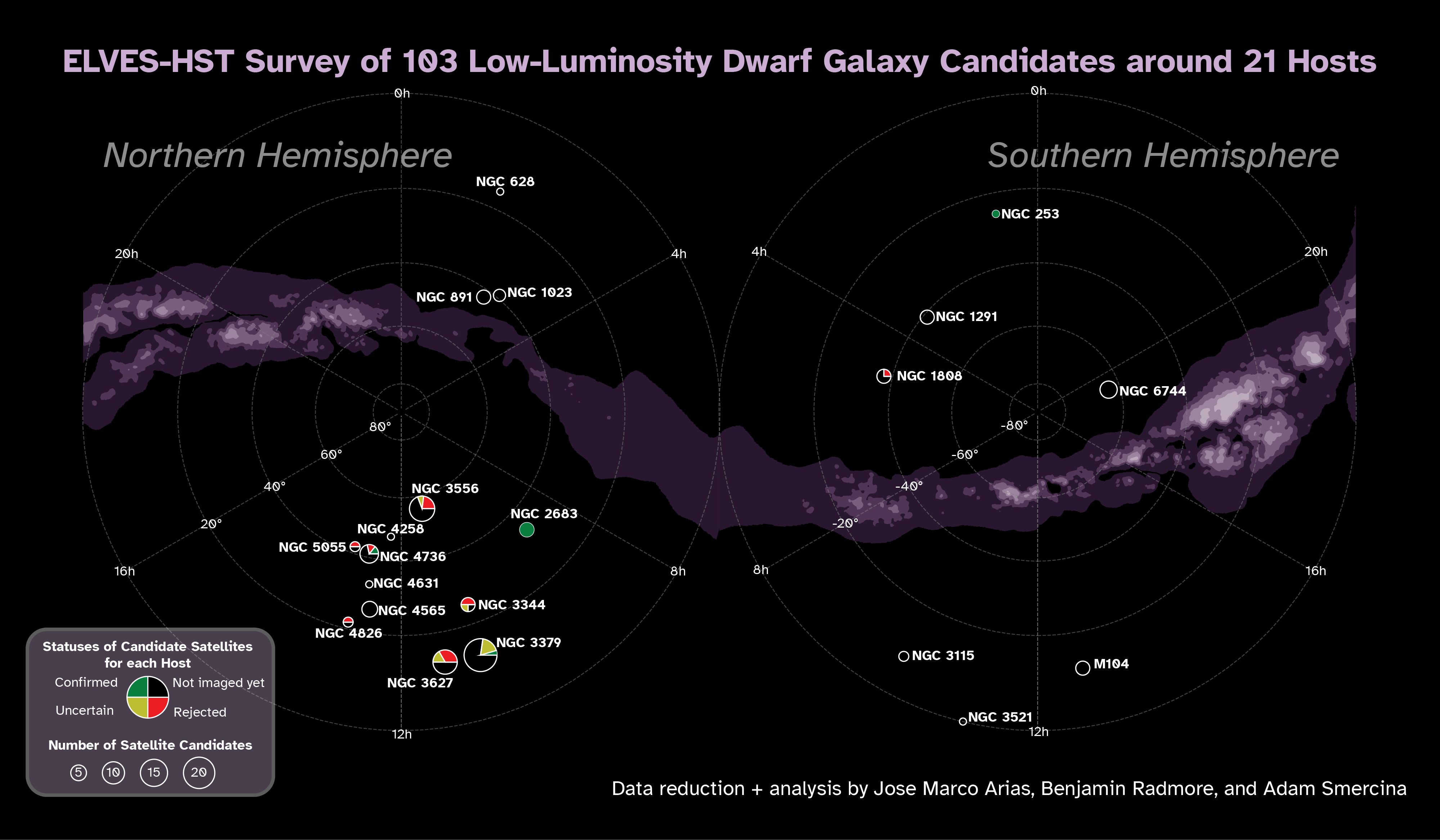
ELVES-HST Survey Graphic
I am currently part of a research team using the Hubble Space Telescope to determine distances to 103 low-luminosity dwarf galaxy candidates around 21 galaxies in the Local Volume.
This survey is still ongoing, and I presented on this project at the Galactic Frontiers II conference in July 2025 at Dartmouth College. As part of my poster, I created a graphic to
illustrate the current status of the survey (pictured below). It shows the locations of the 21 host galaxies on a stereographic projection,
with pie charts showing the fraction of candidate satellite galaxies around each host galaxy that have already been imaged and confirmed by our team, rejected as background objects, are uncertain and require more investigation, or have not yet been observed.
The size of each pie chart is proportional to the number of candidate satellites around that host galaxy.
GLAS Messier Marathon
A popular activity in the amateur astronomy community is the Messier Marathon, where participants try to observe all 110 Messier objects in one night.
The Messier catalog is a list of astronomical objects compiled by the French astronomer Charles Messier in the 18th century, which includes nebulae, star clusters, and galaxies, as objects that astronomers should ignore while searching for comets.
Inadvertently, the Messier catalog has become a list of some of the most popular objects to observe for amateur astronomers, given that many are easily observed from the Northern Hemisphere.
Messier Marathons are often held in the spring (March/April) around a new moon, when it is possible to observe all 110 objects in one night.
In 2022, GLAS Education and Yerkes Observatory hosted a Messier Marathon star party and fundraiser, and I created a poster showcasing all the objects that were observed and imaged during the event. Each object image has a border around it indicating what type of object it is (galaxy, nebula, star cluster, etc.), and the color of the border corresponds to the constellation the object is found in. The poster also includes diagrams of all the constellations that host Messier objects and where each object is located with respect to the constellation. Stars in each constellation are colored by their temperatures.